The original concept behind Tweetpond is News Pond, an ambient real-time visualisation of news headlines built in 2003. This post has been adapted from the original News Pond design documentation.

Table of Contents
Calm technology and ambient displays
The concept of News Pond started evolving in 2001 whilst I was studying at University of Art and Design Media Lab Helsinki. I got a chance to build a realistic, running prototype based on this concept in 2003 when I continued my studies at Swinburne University Faculty of Design.
The foundation of the original News Pond project can be summarised by two concepts: information visualisation and calm technology. Information visualisation is about abstracting data and expressing that abstraction in a visual format to aid comprehension.
Introduced in 1996, calm technology is an attempt to lessen the obtrusiveness of contemporary digital environments. Most current digital systems are reactive, not proactive, and the user has to provide a stimulus to get a reasonable response from the system. For many purposes this engages the user unnecessarily.
Building on the ideas of calm technology the University of California Group for User Interface Research introduces “ambient displays”:
“Ambient displays normally communicate on the periphery of human perception, requiring minimal attention and cognitive load. Perceptual bandwidth is minimized; users get the gist of the state of the data source through a quick glance, aural refocus, or gestalt background ambience.”
News Pond, and now Tweetpond, aim at giving users a gist of the recent updates at just a quick glance.
Concept and inspiration
The concept of News Pond:
“Imagine an aquarium where the fish are replaced with information about the latest news events. By taking a look at the water you can instantly tell whether the latest news are mostly international or local, about sports or other events, and so on. As time passes older items disappear and get replaced with a fresh batch of news. And if you want to, you can read or listen to any news story of interest. This is News Pond, an ambient visualisation of internet news feeds.”
The inspiration for the News Pond visualisation comes from natural and physical phenomena such as water, rain, surfaces, gravity, friction, and inertia. The visualisation is based on the idea of water-like surface representing now, with news events falling through this surface “as things happen”.

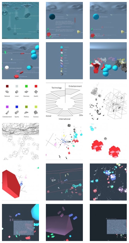
The image above shows one the first News Pond mock-ups and describes the visualisation with surprising accuracy. All important elements are clearly visible:
- water surface on the top of the screen represents current time
- news items are displayed as different geometric shapes depending on their category
- news item title is displayed beside the shape
- vertical position of a news item tells its age – lower (deeper) means older
- water ripples on the surface indicate the position of a recently downloaded news item.
Visual exploration
Ripples on the “water surface” are a core feature of News Pond and they were included already in the earliest concepts. Still, the ripples aren’t there for decorative purposes only; they are used to indicate the position of a recently downloaded news item.
Early sketches of News Pond also included air bubbles emanating from the news items. These were evaluated further with the conclusion that they make the underwater metaphor too literal and hinder comprehension, and subsequently taken out.
News items and categorisation
The basic object in the world of News Pond is the news item i.e. a reported news event. Each news item contains information such as publish time, headline, body, link and category.
Mapping site-specific categories to the News Pond internal categorisation system is not always straightforward as certain categories are available on specific sites only and others differ in level of detail. The final shapes and colours for the different news categories are shown below:

In initial testing several users suggested displaying more representational shapes instead of just simple geometry. However, more complex shapes are harder to recognise and the final News Pond prototype settled on simple geometric shapes as they are:
- readily recognisable
- easy to learn
- easy to tint with colour.
Positioning news items
The visualisation concept reserves the vertical dimension for displaying relative time i.e. the age of a news item. As the world of News Pond is three dimensional this still leaves two dimensions where news items can be freely positioned.
Positioning objects randomly on this two-dimensional plane does not help users find news items of interest. Therefore news items are placed within segments of a “virtual cylinder”, depending on their category. Mouse controls are available to rotate the camera to view an interesting category.

Future development
The original News Pond design documentation from 2003 asks some interesting questions around developing the concept further:
- More advanced news sites provide links to related articles as support material for a new article; how could these relationships be shown visually?
- Could network, temporal or geographical distance between news events (or news providers) be used to enhance the visualisation?
- What would the interface be like if the user was wearing data gloves?
- How could one apply a visualisation like this to more volatile content such e-mail, instant messaging, or SMSes? Furthermore, could the product be modified to enable content creation in addition to pure content consumption?
It’s the second last question I chose to tackle with Tweetpond.
In closing
In building Tweetpond it was interesting to see how easy it was to adapt the News Pond concept from 2003 into the online environment of 2009. The core metaphor remains unchanged even when the application has been repurposed to visualise tweets instead of news headlines.
Some of the News Pond’s original utility specifically around categorisation has been lost in Tweetpond but in my opinion this has been made up by the fact that the underlying information source – Twitter – is real-time by nature, and therefore lends itself to this type of visualisation even better than the original news headlines. Having said that Tweetpond is just an early experiment – a work in progress – and it could evolve to a number different directions in the future.
What do you think? Do you feel Tweetpond is a worthy successor to News Pond?
How would you like to see the Tweetpond concept evolve?
Do you think there is a need for a modern-day News Pond, focusing specifically on news instead of Twitter updates?
News Pond image gallery
This post was originally published on the Tweetpond blog.